
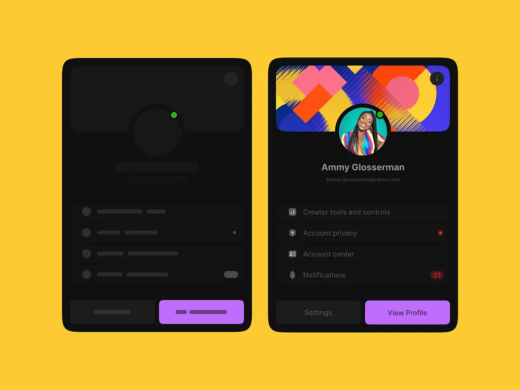
Wireframe & Prototype
A side-by-side exploration showing the transition from low-fidelity wireframe to polished UI for a mobile profile and settings screen. The exercise highlights how structural decisions made at the wireframe stage — layout, hierarchy, action placement — carry directly into the final design with minimal rework. Seeing both states together demonstrates a disciplined design process where functionality is validated before visual polish is applied.
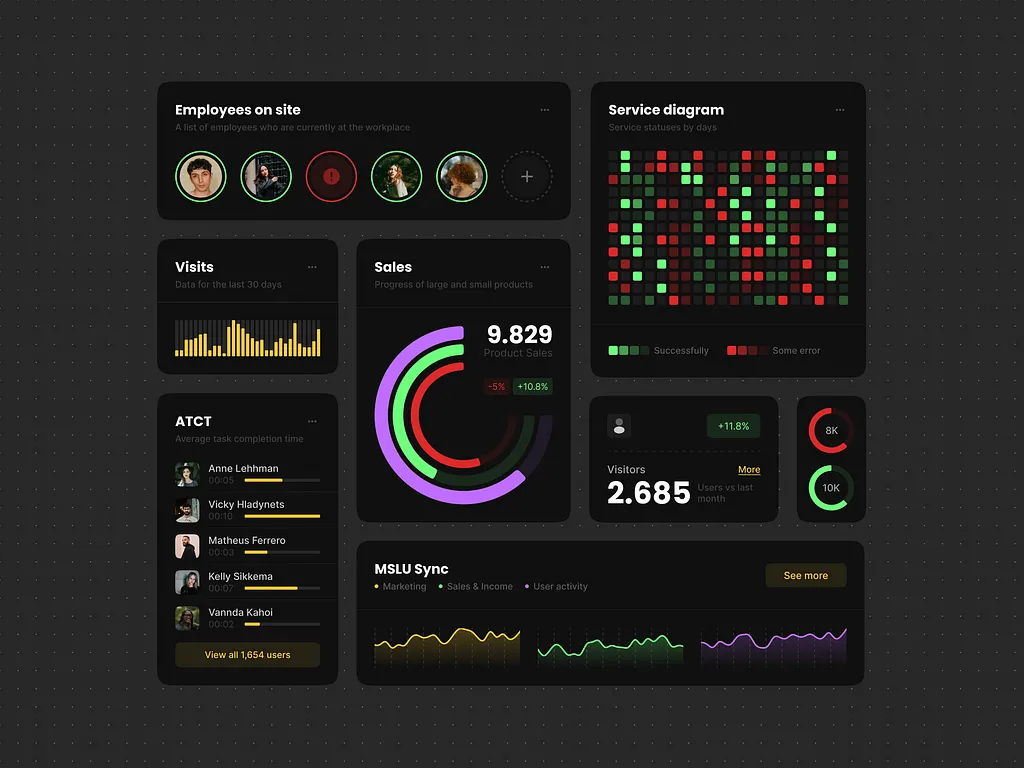
Analytics UI Components 📈
A dark-mode analytics dashboard concept exploring how to present dense, multi-layered data without losing visual clarity. The layout combines employee tracking, sales metrics, service status heatmaps, and activity timelines into a modular card system — each component designed to work both independently and as part of a larger dashboard. The challenge was balancing information density with readability, using color coding, micro-charts, and typographic hierarchy to guide the eye naturally across the screen.
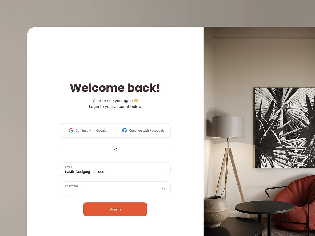
Just Login Page 🤘
A minimal login page exploration focused on making authentication feel warm and inviting rather than cold and transactional. The split-layout pairs a clean white form with a full-height lifestyle image, creating a sense of context and brand personality from the very first screen. Social sign-in options sit above the traditional email and password fields, nudging users toward the fastest path while keeping the fallback easily accessible.
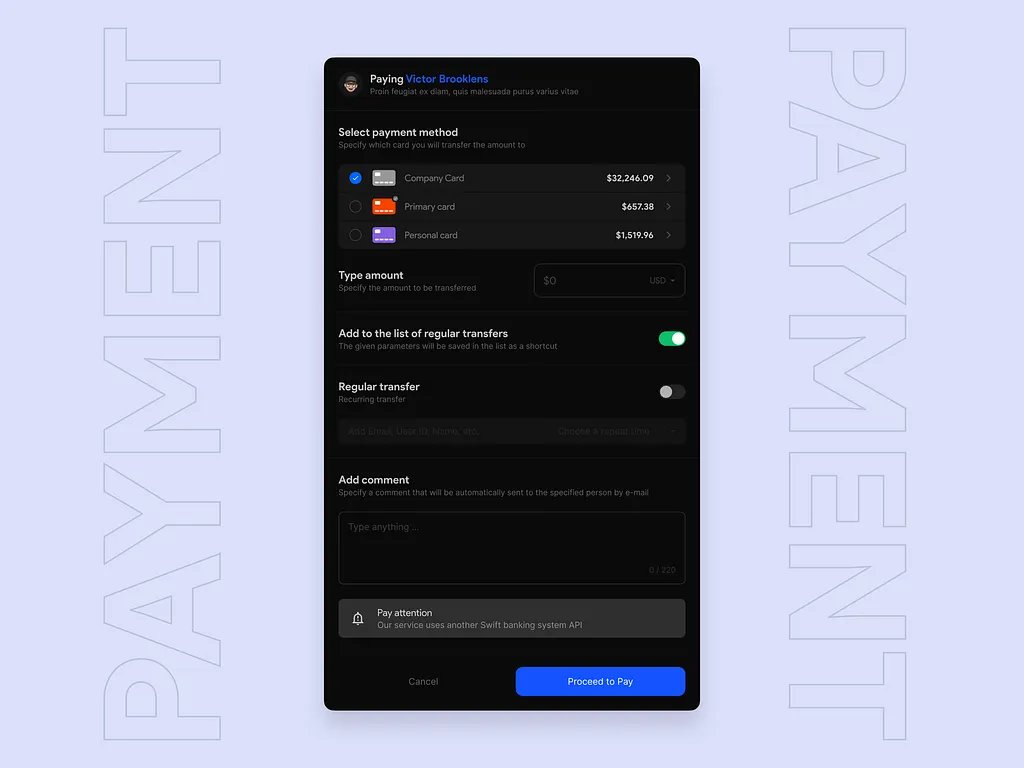
Payment modal - Saas
A payment modal concept for a SaaS banking platform, focused on clarity and trust at a critical user decision point. The challenge was fitting multiple input types — card selection, amount entry, transfer settings, and comments — into a single screen without overwhelming the user. The dark interface with structured grouping keeps the hierarchy clean, while subtle toggles and inline alerts guide the user through the flow confidently.
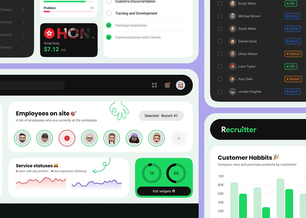
Recruiter v.2.0 - Dashboard
A second-iteration dashboard design for a recruitment and workforce management platform, combining employee tracking, service status monitoring, and customer behavior analytics in one unified interface. The design explores how to serve multiple user roles — recruiters, managers, and analysts — within a single view without creating cognitive overload. Playful touches like emoji avatars and hand-drawn annotations bring personality to an otherwise data-heavy environment, keeping the experience human despite the complexity.
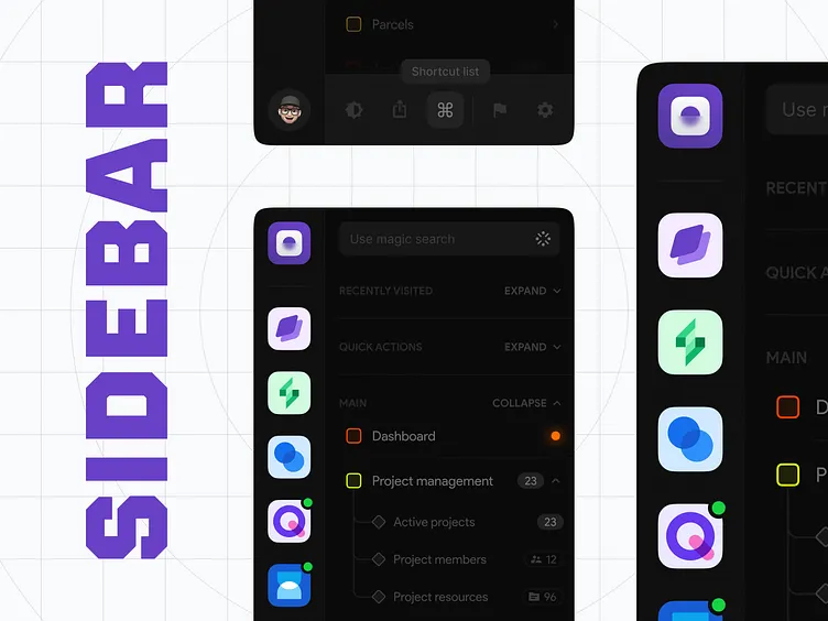
Sidebar - Advanced
An in-depth exploration of sidebar navigation patterns for complex, multi-section web applications. The concept tackles one of the harder problems in product design — how to accommodate deep navigation hierarchies, quick actions, recent history, and global search without making the interface feel cluttered or overwhelming. Collapsible sections, icon-based app switching, and a magic search input work together to give power users speed while keeping casual users oriented.